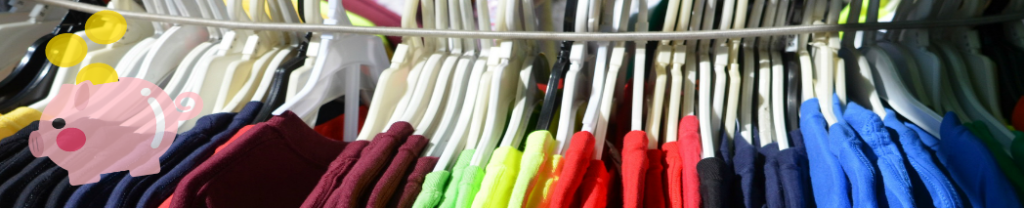
My header was created by myself to capture exactly what my site intends to deliver to my viewers. Essentially my header shows you that you can save money whilst shopping for/thrifting clothes. This is apparent from the multi colored clothing rack in the background, and the piggy bank in the front. When going about finding images for my header I knew it would be essential to explore only free to use options. Therefore, I went to flickr and found perfect images with creative commons licensing that I could use on my site. I knew that I could use these images because they came with the licensing reading “Attribution-NonCommercial-ShareAlike 2.0 Generic (CC BY-NC-SA 2.0)”, which insinuates the creative commons and free use. In terms of my editing process, I applied ideas from the Manovich readings. This was essentially layering my images to create a more standout-ish header. Another thing I used to achieve a header related to the Manovich readings was use the effect of transparency, thus making the header look crisper rather than 2 clunky images put together. In terms of the Davison readings my procedure differed from what was said in the reading. However, although I did not use any of my skills to create my image like that of MS Paint, I still did use the technique of combining 2 images to create a new one. In conclusion I feel as if this image successfully encompasses what my site is about; finding good quality clothing for very cheap.
(https://www.flickr.com/photos/mag3737/13980265427/in/photolist-niovR6-2yrrB-4kbN9S-4kbMKW-9bDgXU-9bDgZ3-8sdE3N-eBstXf-AvH6DR-ESxujA-2yrsV-5dHBgx-bZSr41-8FmMRs-atnd8J-kxaq8s-2hVqeiD-2hVqdZN-58TUBD-bBXW4L-21C5BRX-SfZ5e9-ogMAHS-zBBQzc-7p6z7J-bW35S3-7iEg6u-tBg6X-4EfuYR-aqyGcz-neN4-9ycxPN-2gjCArZ-QfNxGf-296VRoa-9oYGfp-tBg4c-tBg3Q-57SvLB-7QYTkQ-efFYGi-nY3XQs-oy18Er-dL3RvR-bH74Ba-2aqMY9h-8xfSDJ-aNsje8-pVG6pw-2hZjpJu), as the 2nd image is a creative commons image from google images.
(https://cdn.pixabay.com/photo/2020/01/07/12/54/piggy-bank-4747516_960_720.p)
